Noviland, an international online cabinet supplier serving customers worldwide, primarily in North America.
As the sole designer on the project, I led the online platform redesign to help business buyers (ex. purchasing mangers) quickly find products, streamlining the ordering process and driving a 40% increase in sales.

Role
UX Designer
Team
10 Developers, 1 Product manager, 1 UX Designer
Timeline
Feb 2022 - Jun 2022
In 2021, Noviland launched a B2B online platform to transition from offline sales to digital sales due to COVID-19, making offline sales harder. However, four months after the platform’s launch, the sales team observed no significant increase in online orders.
As a result, I was brought onto the project to lead the redesign of the platform with the objective of driving higher online sales and improving the user experience.
Research
Conducted 10 user interview & 1 round of usability testing, and translated key insights into actionable design solutions.
Design
Led the redesign of the filter system, improving the product discovery and ordering experience through creating wireframes and high-fidelity prototypes.
Communication
Facilitated key stakeholder meetings with the founder, product manager, and development team for project scoping and aligning business goals with user needs.
✅ + 40% sales increase post launch
✅ Ordering time cut from 1 hr to 30 mins
✅ 100% positive feedback from sales & customer service
Based on Google Analytics, I identified the following three issues on the current platform.
🔻 Poor conversion rate
(avg. 1.4%)
🔻 Low return rate
(avg. 8%)
🔺 High bounce rate
(avg. 20% ~ 45%)
To identify the problem areas, I created the user flow of end-to-end process and found out that almost 85% of users drop off on the results pages after searching & applying filters, failing to proceed to checkout.

To validate my assumptions about the search and filter features, I conducted interviews with five wholesalers and five sales representatives.
"I searched for a product, but either nothing showed up or the results were irrelevant."
"I don't like using filters. The filtering results doesn't make any sense and it wastes my time."
After meeting with the product manager and founder, we decided to focus on the filter redesign for the next iteration due to the time and technicial constraints.

- It does not clearly communicate what the product is about.
- No clear indication of what's selected;
- Unable to provide accurate results after the filter is applied.
- More product details needed: ex.) cabinet dimension.
New design goals for the next iteration were defined based on user research.
"How might we help customers quickly locate products and streamline the ordering process?"


Updated visual elements to ensure they align with the brand identity and values. Aside from that, three design changes have been made below.
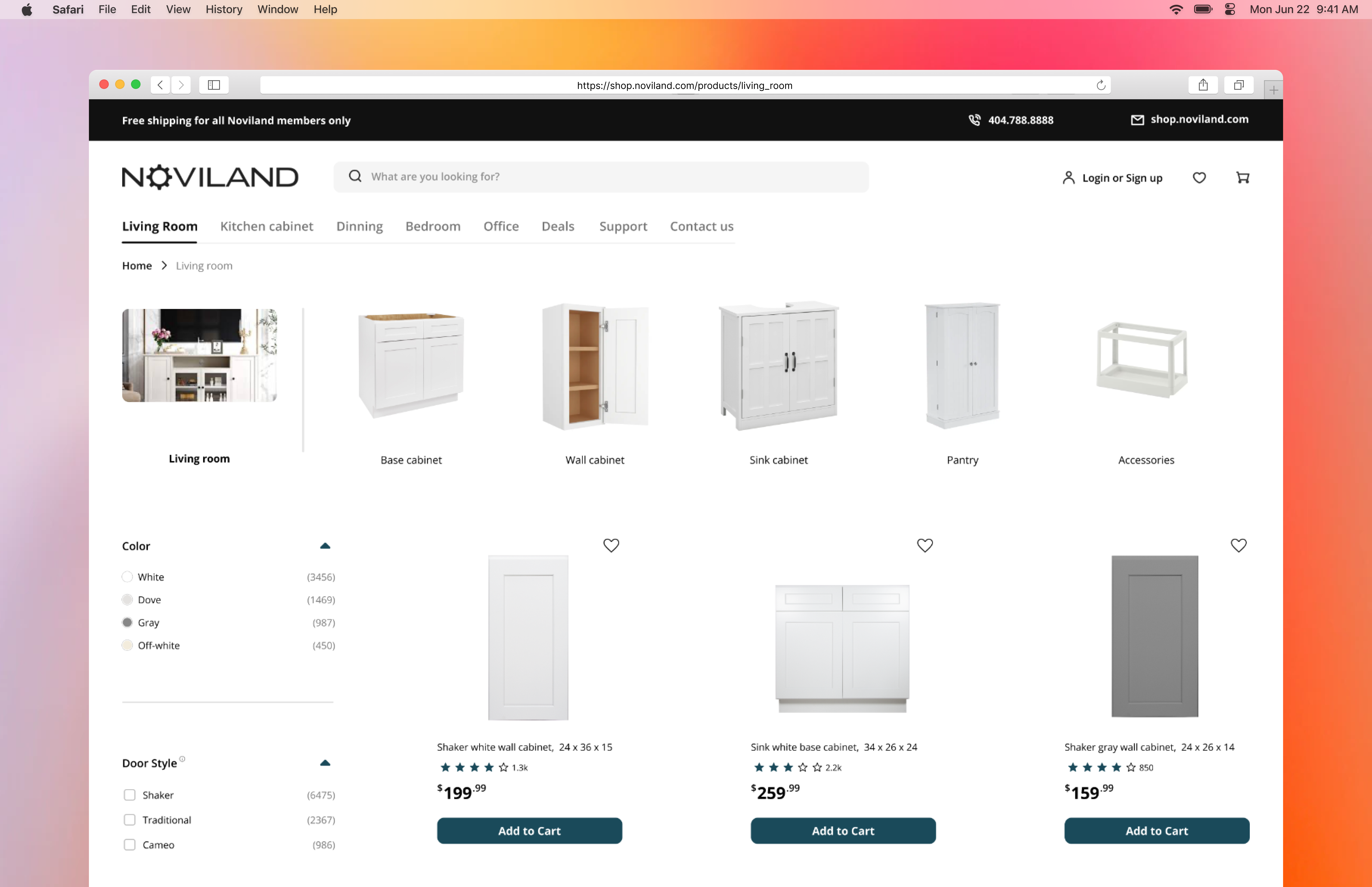
>> 1. Added room types to the navigation menus to help users quickly navigate to a specific page at a glance.

>> 2. Redesigned filter with better feedback and categories to help users quickly find products.

>> 3. Add product dimensions and customer reviews to help users quickly select a product and proceed to checkout.

1. Browse the whole product page
2. Find and filter products
3. Add a product to cart and review details
6 Sales representatives & 2 customer groups (new customer & regular customer)
Most failures occurred when users tried to find and filter products.
> Key Findings
1. Banner draws too much attention: users focus on the banner (join the membership) more than the product itself. This conflicts with our primary business goal (increasing sales).

2. The drop-down filter with limited options is ineffective, and the filter hierarchy is unclear for new customers who are unfamiliar with cabinets.


Through user research, I noticed that cabinets are used differently depending on where they’re placed, like in the kitchen or bedroom.
To make shopping easier, I added room-based categories to the navigation menu and set a default cabinet type filter on every product page. This helps users, especially first-timers, quickly find what they’re looking for.

New user flow for the checkout process

View prototypes
1. Reduced distractions: users now can focus more on product itself.
2. Reduced first-time user's mental: cabinet type is set as the primary filter by default and streamline the process of finding the right products.


1. Improved scannability: provide better visibility of options and allow users to scroll through products.
2. Mobile friendly: Easy to adopt for mobile screens.


